Recognition and severity of death causes - does the media reflect what we are dying of?
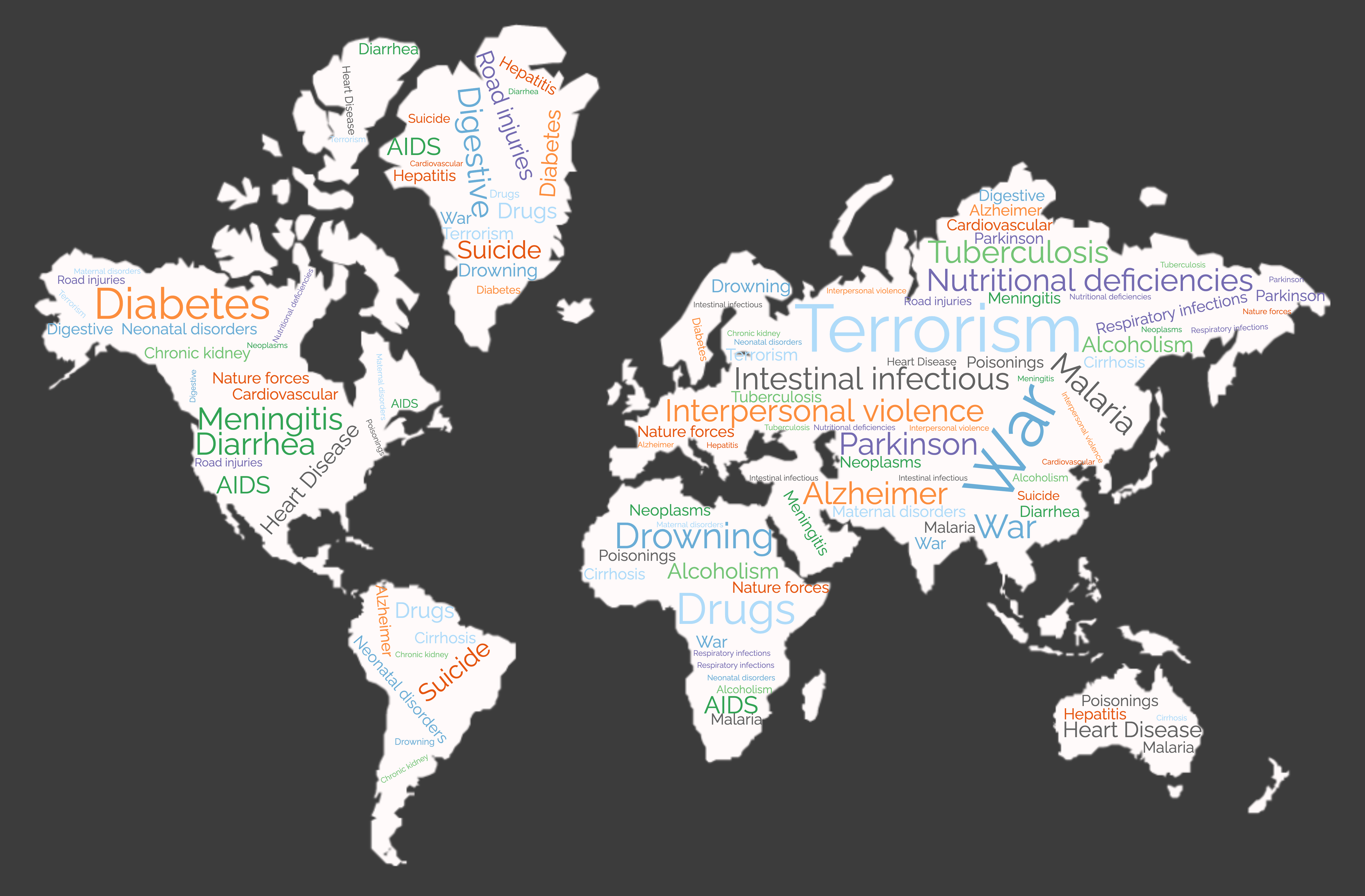
Does the coverage of terrorism match how many people actually die from terrorism? Or suicide? What about some of the most common death causes in the world, like cardiovascular or respiratory diseases?
Due to the sensational nature of media attention, there is unsurprisingly an asymmetry
between the issues with the highest death tolls and which receive the most attention
in the media. But how big is this mismatch exactly, and what are the most disproportionate
death causes out there? With this data story, we aim to identify what are the most common
causes for death in the world, and compare how much media coverage they get.
With this, we try to shed light upon what might be a skewed view arising from what our day-to-day news feed
deliver compared to what the world actually looks like. We investigate wether the amount rise and fall
with the yearly death toll. Finally, an attempt is made to make sense of the spotted imbalances
and to reason why they occur. Are the media only looking for the most sensational stories, or
is there a more reasonable explanation, that the media focusing on deaths that are preventable over
those that there is nothing to do about?
What do we die of?
Here, we explore the amazing data that was used in an article published in Our World in Data, containing
estimations of the annual death tolls and their causes for each and age group
from 1970 to 2017.
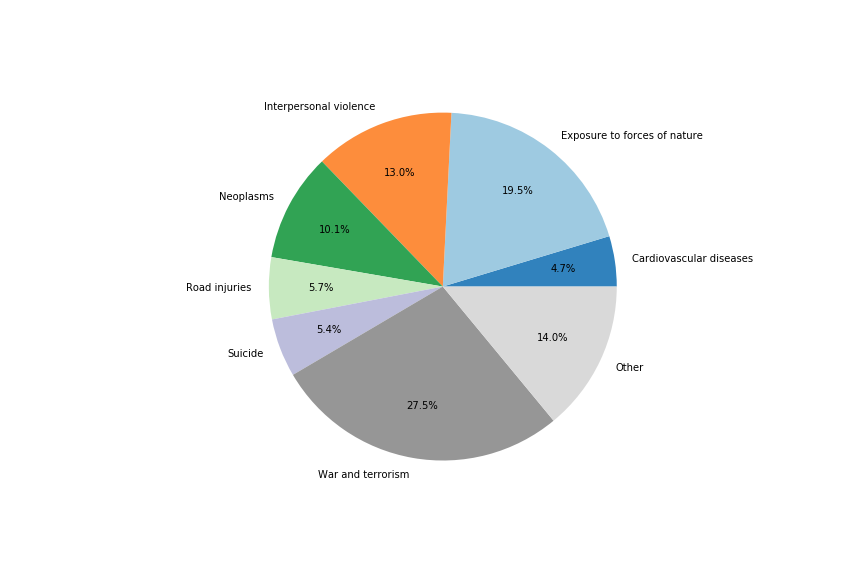
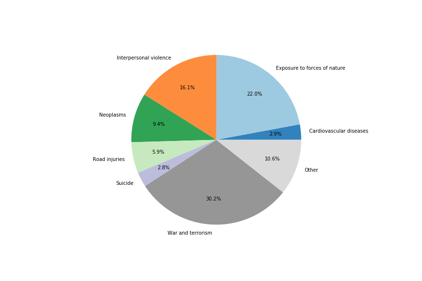
2008
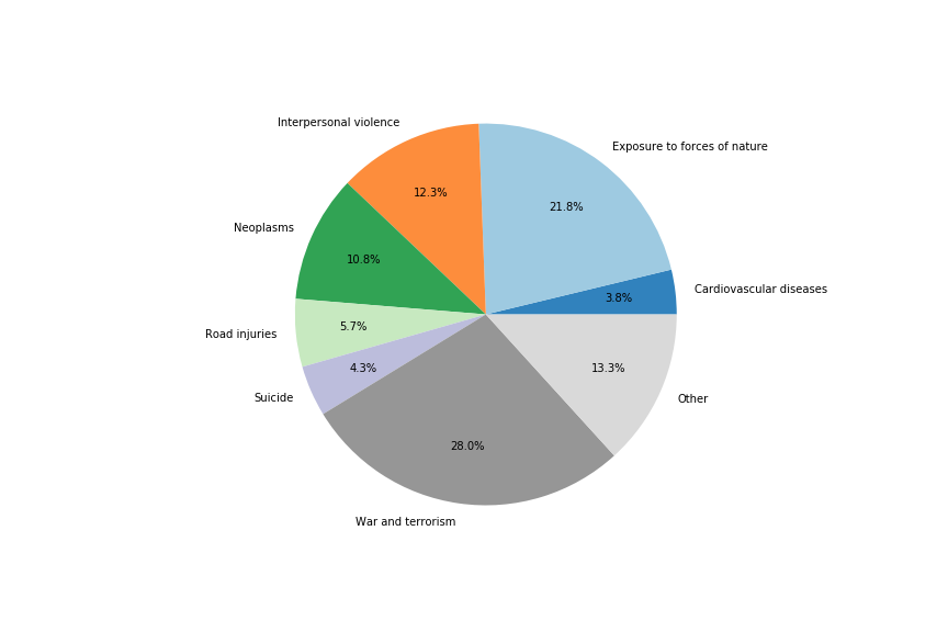
2009
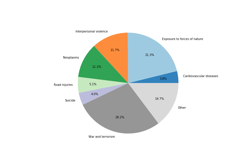
2010

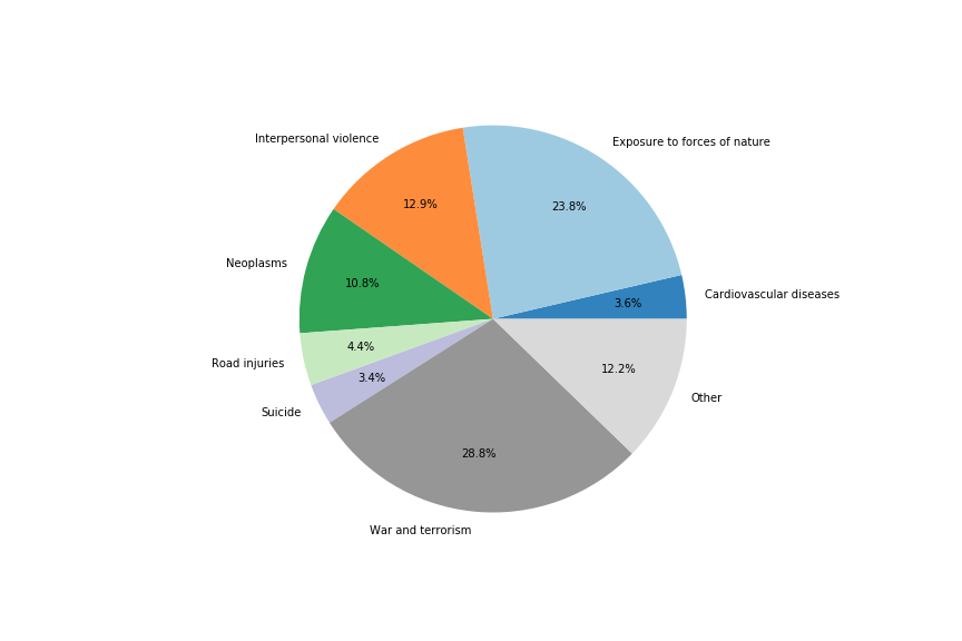
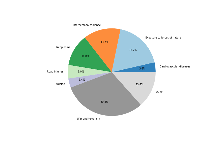
2011
2012

2013

2014

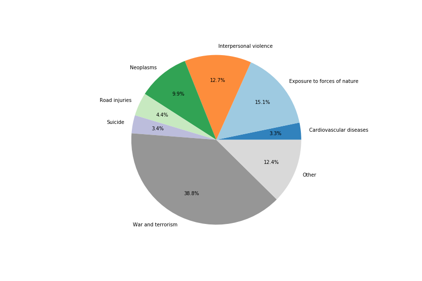
2015

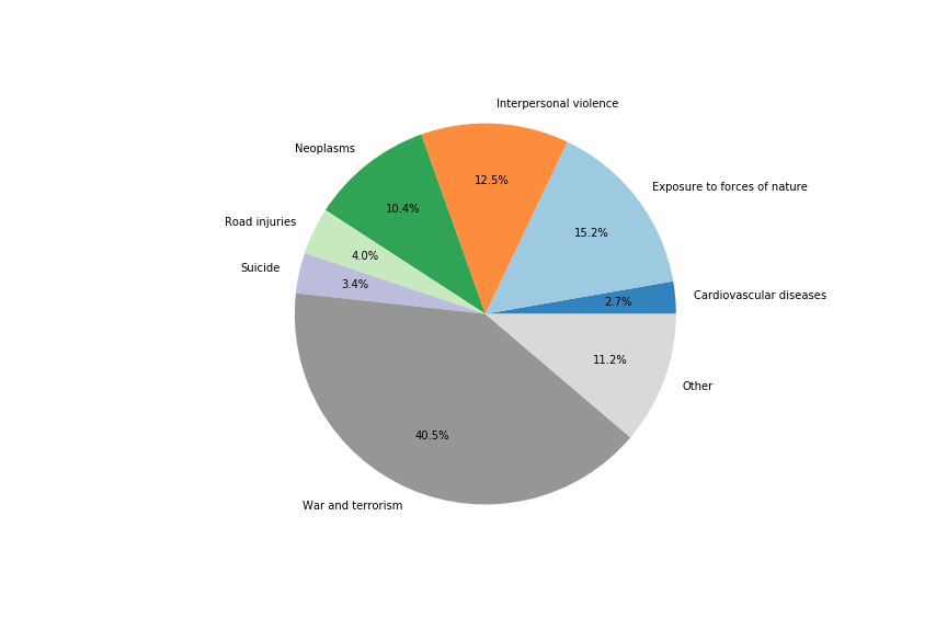
2016
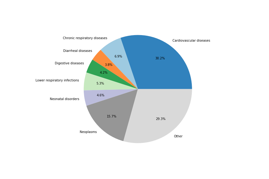
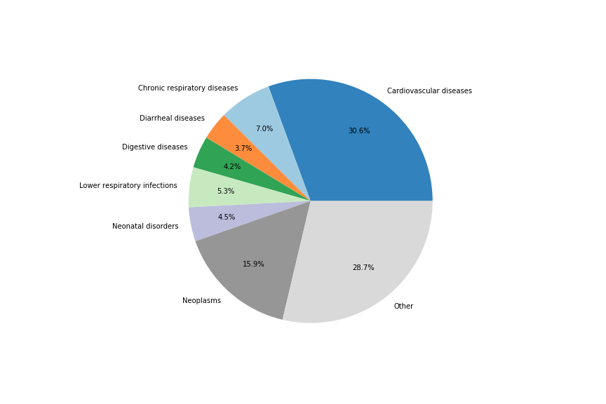
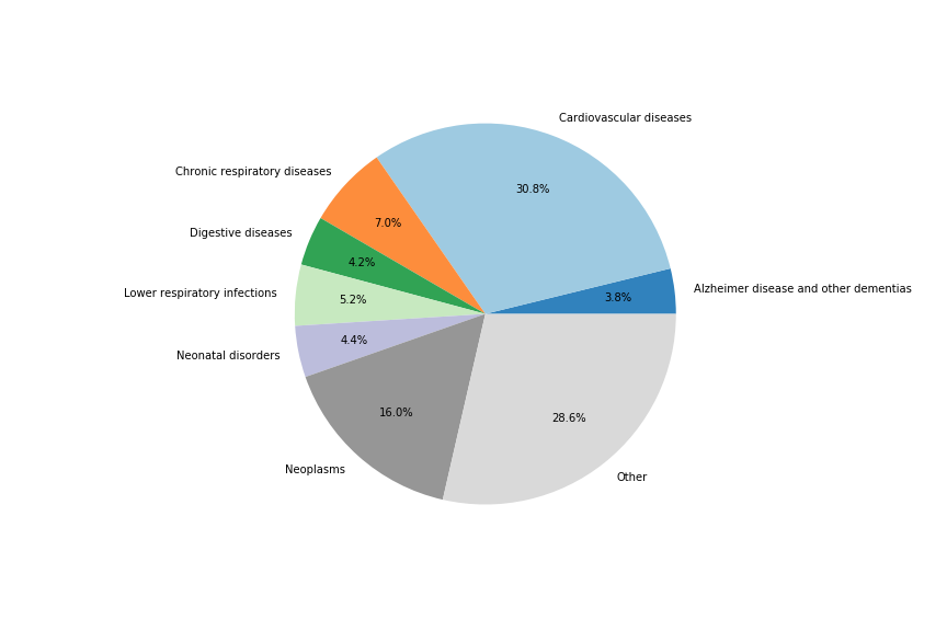
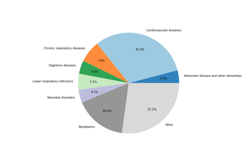
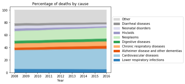
The pie charts above provide a snapshot of the top six causes for death for the years 2008 to 2016, where we see
that the top worldwide death causes remains relatively steady during the years, also indicated by the diagram below.
We see that most people in the world from heart disease, accounting for about the third of the total death toll.
Neoplasms, including all different kinds of cancer, is the second leading cause, accounting for about a sixth of the total.
The other leading causes are lower and chronic respiratory diseases, digestive diseases, alzheimer and neonatal
diseases. About a fourth of the death toll is caused by other, minor causes. These include for example diabetes, stroke,
pneumonia and influenza.
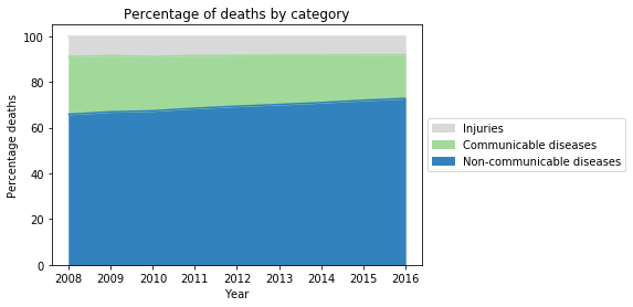
Next, the death causes can be categorized into three kinds - communicable and non-communicable diseases, and injuries.
Communicable diseases are diseases that are infectious or transmissable. These include for example deaths resulting from
malnutrition, malaria and neonatal diseases, and are often preventable. Hence, they are more frequent in low-income countries
than in high-income countries. This category also includes maternal deaths, neonatal deaths and deaths from malnutrition. They are grouped together with the communicable diseases because they mostly affect the same group of people from low-income countries. Non-communicable disease are more in nature more long-term illnesses such as
cardiovascular diseases, neoplasms/cancers, and respiratory diseases. Injuries on the other hand are deaths caused
by e.g. accidents, suicides, and conflicts.
We see from the figure below that non-communicable diseases dominate. We also see that slowly but steadily, the share of
non-communicable diseases increase their share and communicable diseases decrease.
Next, we look at how the death causes looks like for the different continents.
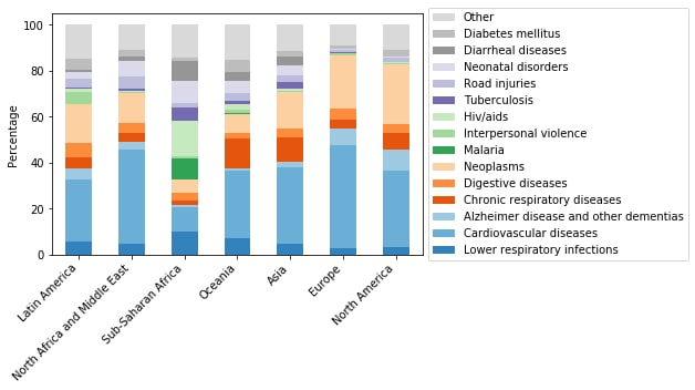
The figure above displays the share of the top death causes for each continent when aggregating over the years 2008 to 2016. From this, we see
that causes such as cardiovascular diseases and neoplasms have a larger
share of the total death toll in continents such as Europe and North America, where many high income
countries are. On the other hand, in Sub-Saharan Africa, a region with more lower-income countries, these diseases have a lower
share. Diseases such as HIV
and Malaria have higher share here, indicating that this is a larger problem than in other continents.
Which death causes receive the most attention?
The key source of data used to identify media attention is Quotebank. This is an open dataset of 178 million unique quotations, extracted
from 196 million English news articles crawled from over 377 thousand web domains, with data between 2008 and 2020 (we analyzed the years 2008-2016).
By identifying and counting how many times a certain issue is mentioned, we can get a decent estimation of how much media attention the issue gets.
In order to identify when a certain quote mentions a particular death, we first created manually a list of keywords related to the topics of the Our World in Data.
Next, we expanded these keywords by looking for aliases on Wikidata and finding synonyms using Wordnet. After identification of quotes in the dataset and grouping
them in the topics, we saw that some topics had quotes which we are obviously not about the topic we wanted. For example, the topic poisoning contained quotes about
water being poisoned with lead, but also about the political debate being poisoned. To filter out the latter type of quotes, we performed clustering on the quotes
and kept only those clusters which were about the intended topic.
The table below displays some example quotes concerning a certain topic.
| Death cause | Example of quotes from 2011 |
|---|---|
| Alzeimer disease and other dementias | It turns out that asians and indians have a much lower incidence of alzheimer's disease and we believe it may have something to do with their high intake of curry sauce. |
| Intellect neurosciences is at the forefront of alzheimer's research, with a rich pipeline and intellectual property portfolio and licensed products in late-stage clinical development. | |
| From patient data to personalised healthcare in alzheimer's disease. | |
| Interpersonal violence | How can it be a direct assault on the judiciary when the mayor was only preventing a massacre from happening? |
| Dcfs is aware that mel is going to be charged with a misdemeanor domestic violence charge, and that didn't change the outcome of their findings, period. | |
| No one can argue the welfare system has achieved any of its goals. Poverty, domestic violence, child abuse and crime have flourished under the modern day welfare system. |
In order to identify when a certain quote mentions a particular death, we first created manually a list of keywords
related to the topics of the Our World in Data. Next, we expanded these keywords by looking for aliases on Wikidata
and finding synonyms using Wordnet. After identification of quotes in the dataset and grouping them in the topics,
we saw that some topics had quotes which we’re obviously not about the topic we wanted. For example, the topic poisoning
contained quotes about water being poisoned with lead, but also about the political debate being poisoned. To filter out
the latter type of quotes, we performed clustering on the quotes and kept only those clusters which were about the intended
topic.
URL
Speaker
2008
URL
Speaker
2009
URL
Speaker
2010
URL
Speaker
2011
URL
Speaker
2012
URL
Speaker
2013
URL
Speaker
2014
URL
Speaker
2015
URL
Speaker
2016
| No Data | 0-1 | 1-2 | 2-3 | 3-4 | 4-5 | 5-6 |
World map of where the URL or the speaker of the quote is from. The scale is logarithmic, so the countries are grouped
from 10^0 to 10^1 quotes up to 10^5 to 10^6 quotes, as can be seen in the legend.
2008
2009
2010
2011
2012
2013
2014
2015
2016
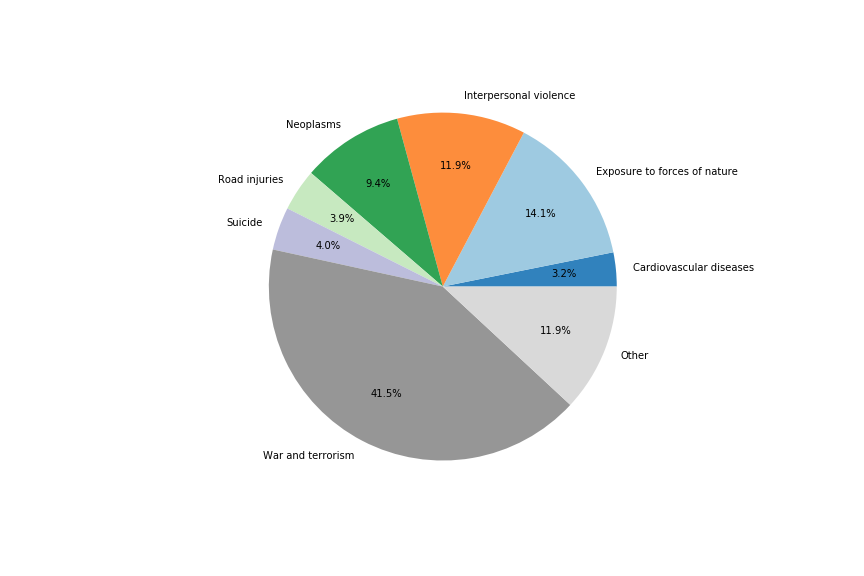
The pie charts above shows the share of a certain death cause mentioned of the total quotes concerning a death cause.
It is evident that it differs from the actual death toll, as none of the top causes of death are mentioned, with the
exception of neoplasms. Rather, the most talked about issue is war and terrorism, accounting for almost a fourth of the
attention. Exposure to forces of nature, including weather and natural disasters, accounts for about a third. The other
most talked about issues include road injuries, suicide, interpersonal violance, and finally neoplasms.
Where are the asymmetries?
The Figure below displays the number of quotes per million death, plotted on a log scale and sorted from high to low.
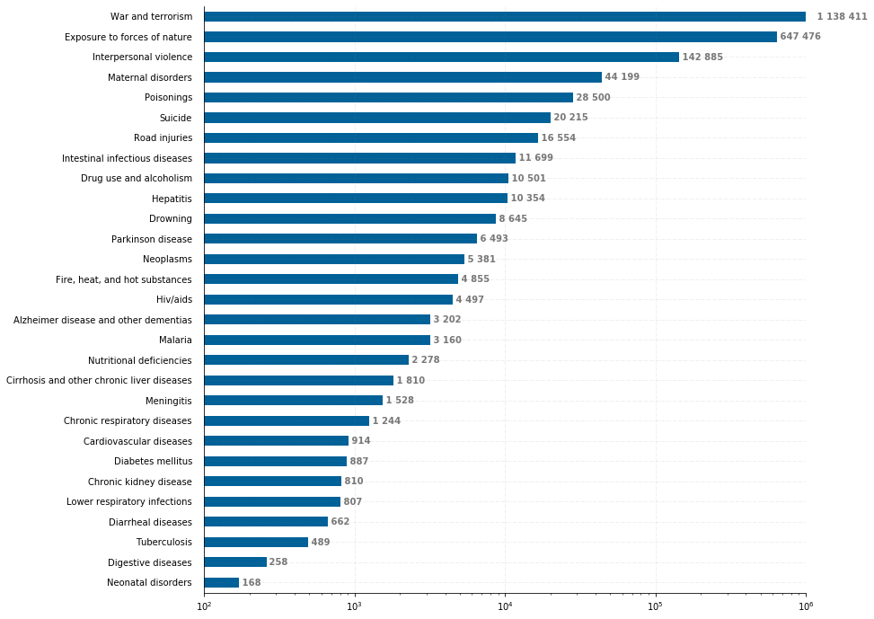
We see that war and terrorism is by far the death cause that is the most overrepresented in the media, with 1004675 quotes per million deaths.
The other most overrepresentative causes are exposure to forces of nature, interpersonal violence, and fire, heat & hot substances. Looking at
the other side, the most underrepresentative causes are neonatal disorders, digestive diseases, tuberculosis, diarrheal diseases and chronic kidney disease.
What kinds of causes get more attention?
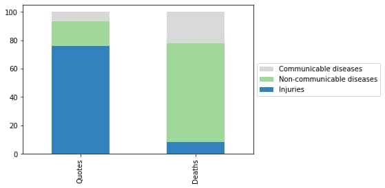
When we group the death causes by our three categories, we see a significant asymmetry between the quote and death data.
Generally, injuries are more spoken about than communicable and non-communicable diseases. One possible explanation for
this is that injuries happen spontaneously and are more interesting for the news to write about. For example, malaria deaths
have occurred for a long time without any drastic changes and will receive less attention than e.g., a terrorist attack.
Another explanation for this asymmetry is that the issues grouped in injuries sometimes are written about for reasons other
than death and suffering. For example, wars, as previously discussed, are also written about because of power struggles.
Our quote data is mainly from wealthy developed countries, which also might contribute to this asymmetry.
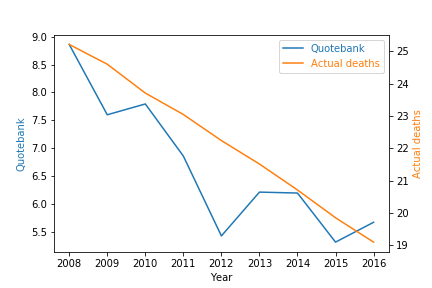
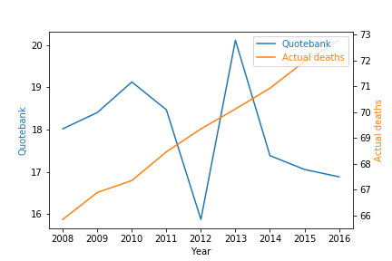
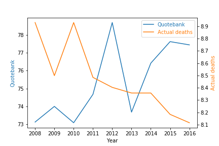
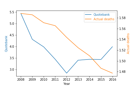
Does media attention grow or decrease with the death toll?
Next, we look at the degree of which the rise or fall of the death toll of a certain topic affect the media's attention to that cause.
The figures below show line plots of the death toll of injuries, communicable and non-communicable diseases, together with the amount of
quotes captured per year.
Communicable Diseases
Non-Communicable Diseases
Injuries
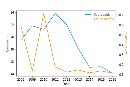
Although the communicable diseases seem to decraese in the same rate as the death toll, we cannot see the same tendency in injuries
and the non-communicable diseases. However, looking at the most overrepresentative death causes, such as terrorism & war and
suicide, we see some degree of correlation. This is shown in the figures below.
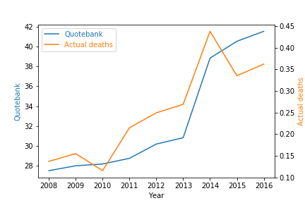
War and Terrorism
Suicide
Exposure to forces of nature
Conclusions
This research combined quote data, which we extracted from QuoteBank using artificial intelligence, with death statistics from Our World in Data. We found out that non-communicable diseases such as cardiovascular diseases dominate the death data. On the other hand, injuries such as war and terrorism dominate the news. This asymmetry may result from the newspapers' focus on telling us about drastic or sudden changes in the world. As injuries are often much more applicable to sensational storytelling than communicable and non-communicable diseases, they will hence receive more attention. In addition, some injuries are discussed in the news because people are talking about the state of the world, not necessarily because they cause deaths. We also found that the number of quotes correlates with deaths for some death causes, but the correlation was not significant.